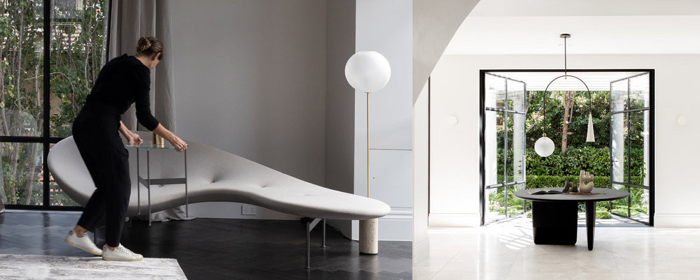
For Eternally Yours we meet designer Sophia Leopardi of Adelaide studio Williams Burton Leopardi, an architecture practice that believes living well, understanding design nuances and celebrating life’s daily rituals creates living spaces which transcend style and 'give an immediate sense of belonging and comfort'.
More Space: Hi Sophia, what is a favourite piece of design and how did it capture your attention?
Sophia Leopardi: Antonio Citterio’s Kalos Armchair for Maxalto. I first saw the Kalos in the book, ‘The Making of a House’, by Janne Faulkner and Anstee Harley. I was gifted it in 2003, the same year I graduated and began my journey with Williams Burton Architects (now Williams Burton Leopardi). Seeing the restrained and elegant compositions on those pages, and the masterful way in which contemporary design could sit alongside storied spaces and antiques, deeply imprinted on me. The armchair with its easy elegance typifies a design that can transcend styles and trends and remains a favourite in our studio.
Furniture is such a strong form of personal expression, what is your selection process?
Designing someone’s home is so personal and such a privilege to be a part of. At the heart of our role is uncovering who we are designing for and what matters to them, what moves them. Furnishing the space is an intrinsic part of this process. Encouraging reflection on how someone wants their space to feel is always the first step – we propose a design narrative that encapsulates the aspirations of the project and use this to underpin all of the decisions, big and small, including the selection of furniture. Being thoughtful and purposeful with what will furnish the space allows us to temper and balance the surrounding elements and detail. The right choice and investment in furniture, lighting and objects can often do the 'heavy lifting' and give an immediate sense of belonging and comfort.
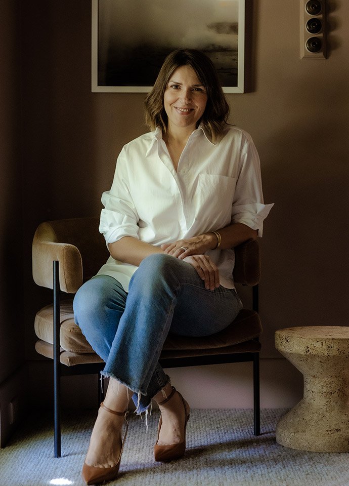
Portrait of Sophia Leopardi © Caroline Cameron.
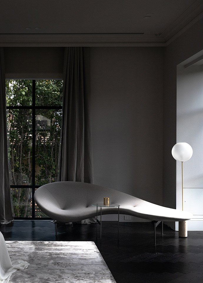
The sculptural Eda-Mame designed by Piero Lissoni for B&B Italia features in the bedroom of the Stanley Residence by Williams Burton Leopardi. Photo © Caroline Cameron.
"At the heart of our role is uncovering who we are designing for and what matters to them, what moves them. Furnishing the space is an intrinsic part of this process.”
Sophia Leopardi, Williams Burton Leopardi
What pieces are on your go-to list?
Piero Lissoni’s Eda-Mame. It’s playful, elegant and sits somewhere between furniture and sculpture. I love the idea that something so achingly beautiful could be inspired by a bean. It’s all about the vision and the exquisite refinement and execution that brings it to life.
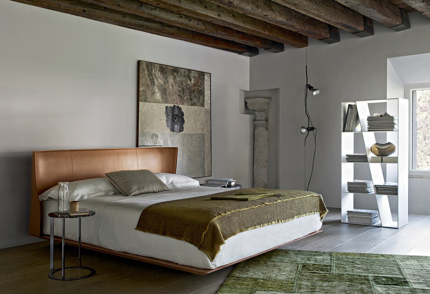
Gabriele and Oscar Buratti’s Alys Bed for B&B Italia is beautifully crafted and finely balanced in every aspect. The soft winged curves across the back of the headboard are executed in a thick single sheet of leather and the way the base hovers makes you tread a little slower and lighter when you share the room with it.
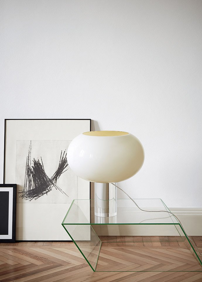
Rodolfo Dordoni’s Buds 2 Table Lamp in white by Foscarini has a simplicity of form that belies the complexity that sits within the process to create this piece. It feels timeless and not overwrought in any way. The change in tone of the handblown shade, when illuminated, is like having two versions of the same piece. The light through the white glass just makes me happy.
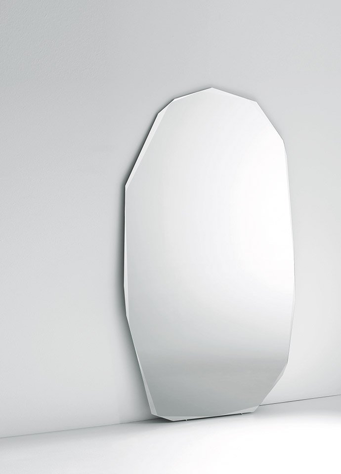
Piero Lissoni’s Kooh-I-Noor Specchi Mirror for Glas Italia. Glas Italia’s collections and Piero Lissoni’s designs are longstanding inspirations of mine. I find myself falling in love with their work before I’m even aware they are the author or maker. I love the concept of reflection and transparency within interiors to bring a layer that’s alive and forever changing, but not overpowering or immediately obvious. This piece embodies this idea with a sculptural subtilty that takes the traditional bevel and cuts it with a jeweller’s precision.
"The sculptural form of the Tobi-Ishi balances the expanded volume and is enjoyed everyday. It inspires a moment of repose during the bustle of its owners’ everyday family life."
Sophia Leopardi, Williams Burton Leopardi
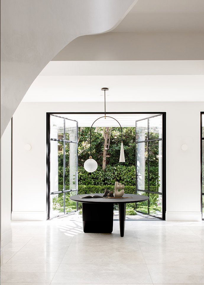
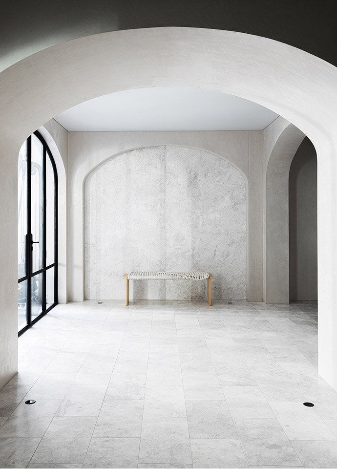
WBL's recently completed Stanley Residence features the Tobi-Ishi Table that serves 'as a punctuation at the end of a reimagined grand entry hall'. Photo © Caroline Cameron.
Furniture has a way of defining the moment, influencing the way we live and making us happy. Can you describe a recent project that has had a transformative affect, and how?
Our recently completed Stanley Residence features the incredible Tobi-Ishi Table as a punctuation at the end of a reimagined grand entry hall. The space it occupies informed one of the key challenges within the brief, centring around a circulation flow that bottlenecked at just the wrong spot. The reworked and expanded interior planning now creates a generosity of space and a free-flowing connection between the formal and informal living areas. The sculptural form of the Tobi-Ishi balances the volume and is enjoyed everyday. It inspires a moment of repose during the bustle of its owners’ everyday family life.
Thanks Sophia, nice to catch up with you.
